
Ed Benguiat, Namesake of the Stranger Things Title Font, Has Died at 92
Netflix
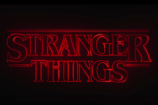
You may not know his name, but you definitely know at least one of the typefaces he named after himself. The Stranger Things title sequence made ITC Benguiat famous again four decades after its original release in 1977.
Namesake designer Ed Benguiat died last week, leaving behind a legendary body of work in the world of typography. He created hundreds of typefaces—many of them still well known today, like Bookman and Souvenir. He designed logos for Coca-Cola, the New York Times, Ford, and other famous names. You might also recognize his work from the logotype for the original Planet of the Apes.
The New York Times writes in its obituary: “His hand was behind more than 600 typefaces, several of which bear his name (which is pronounced ben-GAT). The Telegraph of Britain, in a 2016 article about him prompted by the striking use of one of his fonts (ITC Benguiat) in the title sequence of the hit Netflix series ‘Stranger Things,’ called him ‘one of the type industry’s greats.'”
Read more about Benguiat at the New York Times or browse his work at Fonts in Use. You can also learn about the creation of the Stranger Things title sequence at the Radio Times.
Follow @TwinCitiesGeeks on Twitter or Like Twin Cities Geek on Facebook for more great stuff from Minnesota geeks in your feed!
About the Author

Madeleine Vasaly
Madeleine is Twin Cities Geek's co-head and senior editor, managing the editorial team and running the organization with editor-in-chief Hal Bichel. She's also a freelance editor, proofreader, and publishing consultant and the author of The Proofreader's Guide to Comic Book Style.


